

Time to Complete Module: 1 hour
Last updated: April 03, 2025
IN THIS MODULE
Each module in this guide includes instructions for building a specific page based on a sample design created by our Wix expert (Portfolio Website, Digital Agency, Local Business). You can switch to an alternative version of this module by clicking a different design in the left sidebar under “Alternative Designs.“
5.1 Hero Section
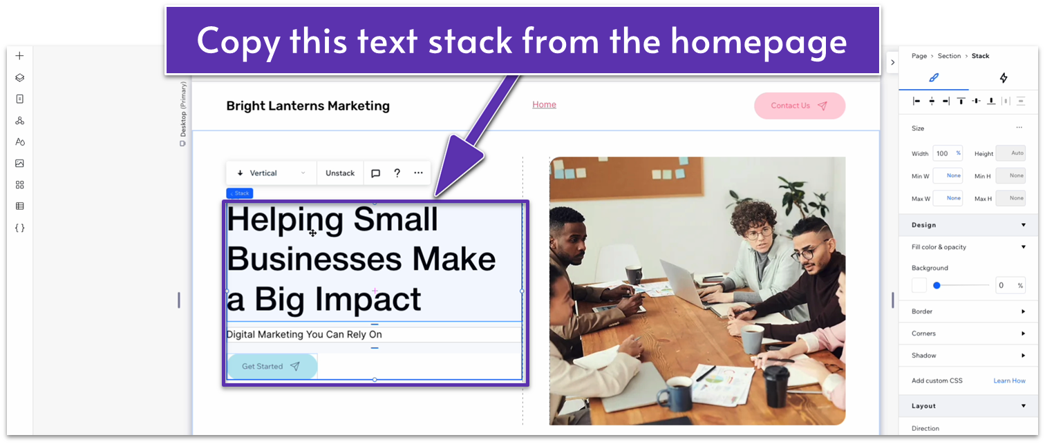
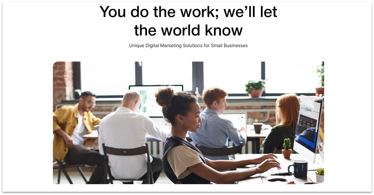 We’ll create a simple hero section with a big heading and an image. We’ll keep this section relatively simple since we want the “services” portion of the page to steal the limelight.
Step 1: Create a new section and apply an advanced CSS grid to it.
We’ll create a simple hero section with a big heading and an image. We’ll keep this section relatively simple since we want the “services” portion of the page to steal the limelight.
Step 1: Create a new section and apply an advanced CSS grid to it.- Set the layout to 1×2 (
). - Set the top padding (
) for the section to a 50px scale. - Set the bottom padding (
) to an 80px scale.
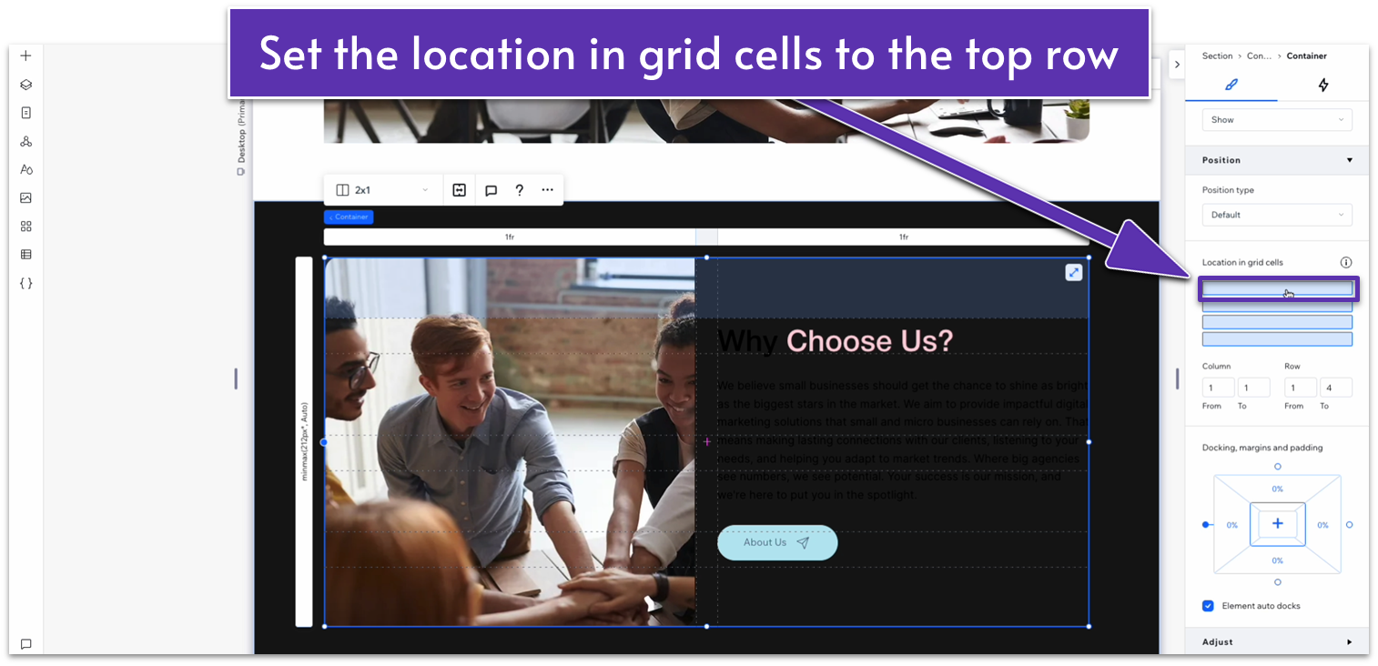
 Step 3: Paste the text into the top row.
- Set its location in grid cells to the top row.
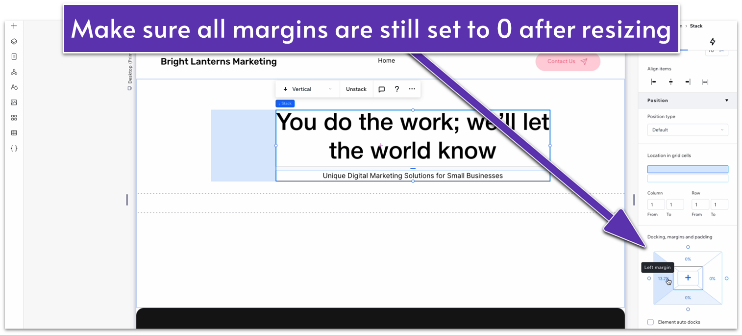
- Set all margins (
, , , ) to 0. - Turn advanced settings of size off.
- Align both text elements to the center (
). - Delete the button at the bottom.
- Replace the text with something appropriate for this section
- Set the stack’s width to 720px.
 ! Docking menu update:
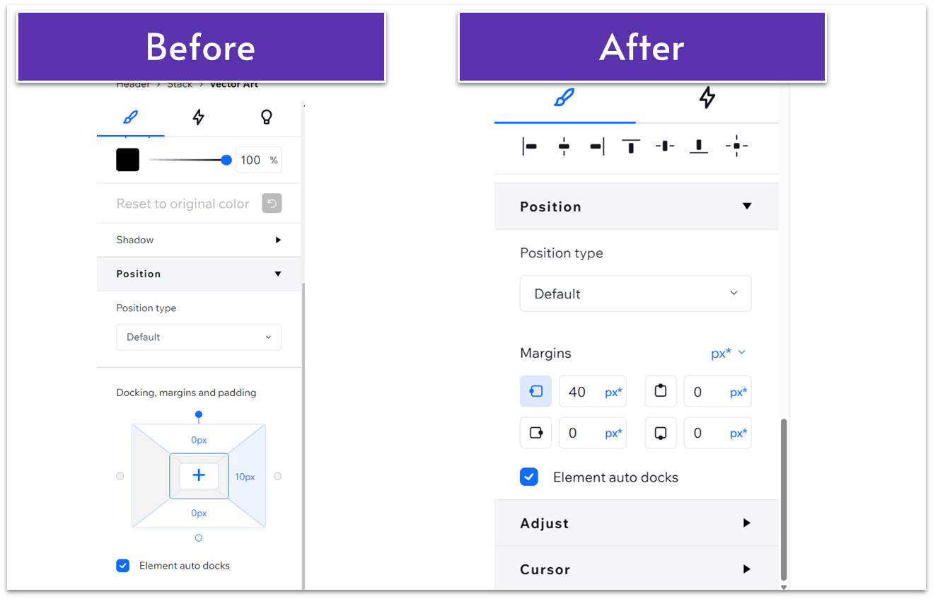
Update: The Wix Studio interface has recently been updated. Now, instead of a single “Docking, margins, and padding” menu, there are separate menus for each. The docking menu no longer appears as the diagram shown in the “before” image. Instead, you can edit each individual margin and its docking under the “margins” menu. Functionality remains the same.
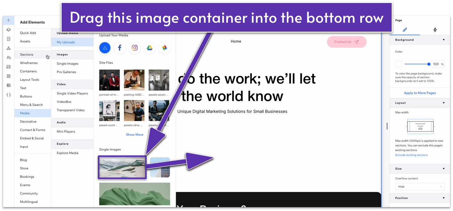
Step 4: Drag an image container into the bottom row.- Select the landscape image from the “Add Elements” menu (
).
- Set all margins to 0.
- Unlock the corner radius options and set the top-left and bottom-right borders to a 20px radius.
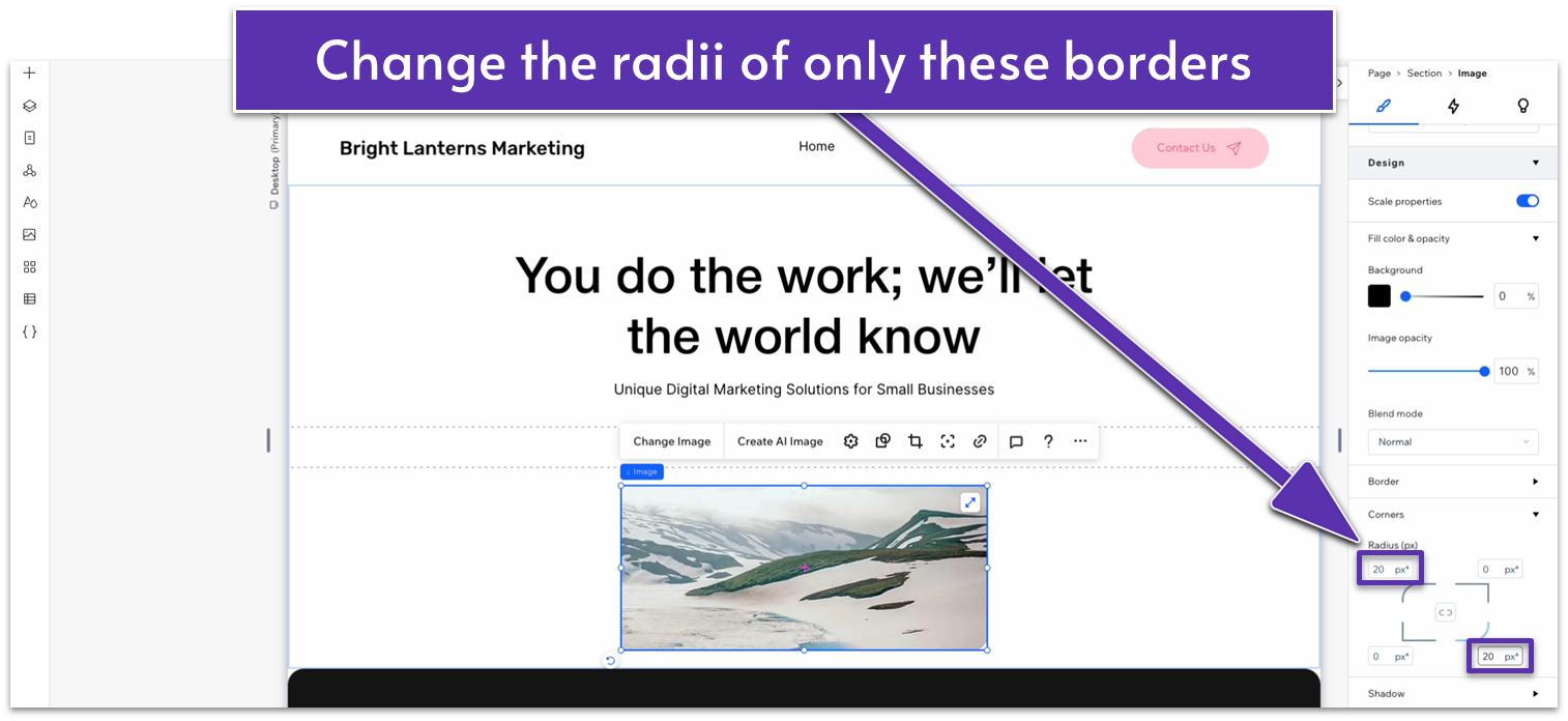
- Lock the image’s aspect ratio (
). - Set the image’s width to 1080px.
- Replace the default image with one from your gallery.
Adapt for Tablet and Mobile Views
Step 1: Adapt for tablet view. On tablet view (- Set the image’s width to 720px.
- Set the bottom padding (
) to 70px. - Change the top-left and bottom-right corner radius for the image to 20px.
- Set the image’s width to 350px.
- Unlock the image’s aspect ratio and set its height to 250px.
- Set the text stack’s width to 350px.
- Set the vertical gaps (
) of the section to 30px. - Set the top padding (
) to 30px. - Set the bottom padding (
) to 70px. - Change the top-left and bottom-right corner radius of the image to 20px.
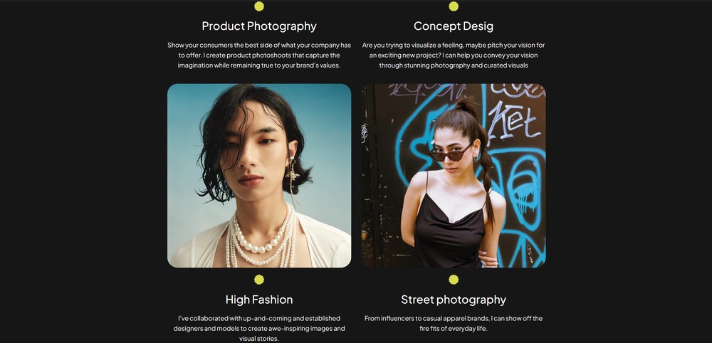
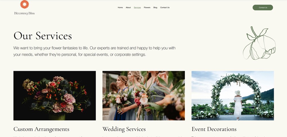
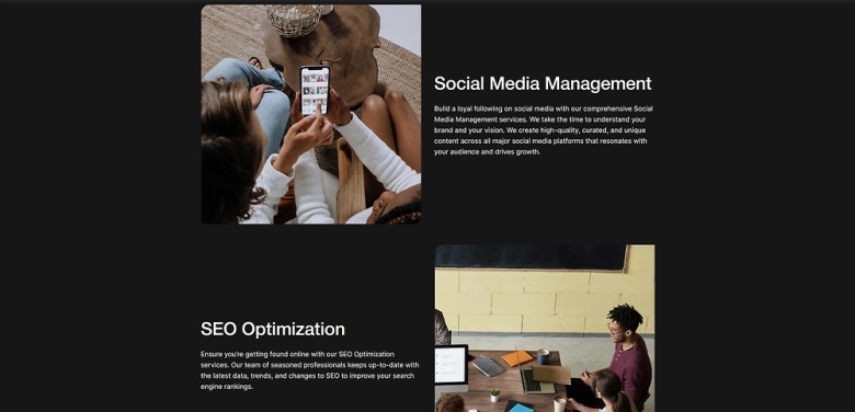
5.2 Services Section
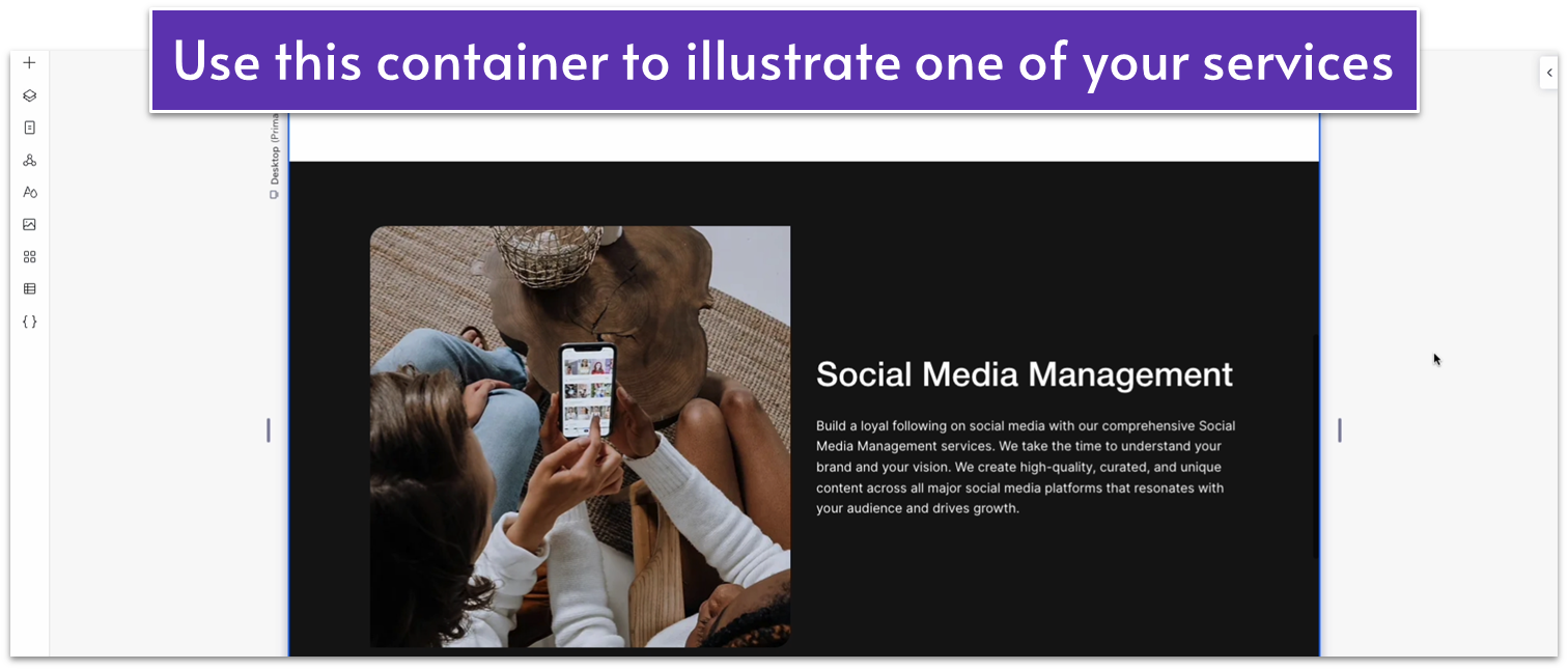
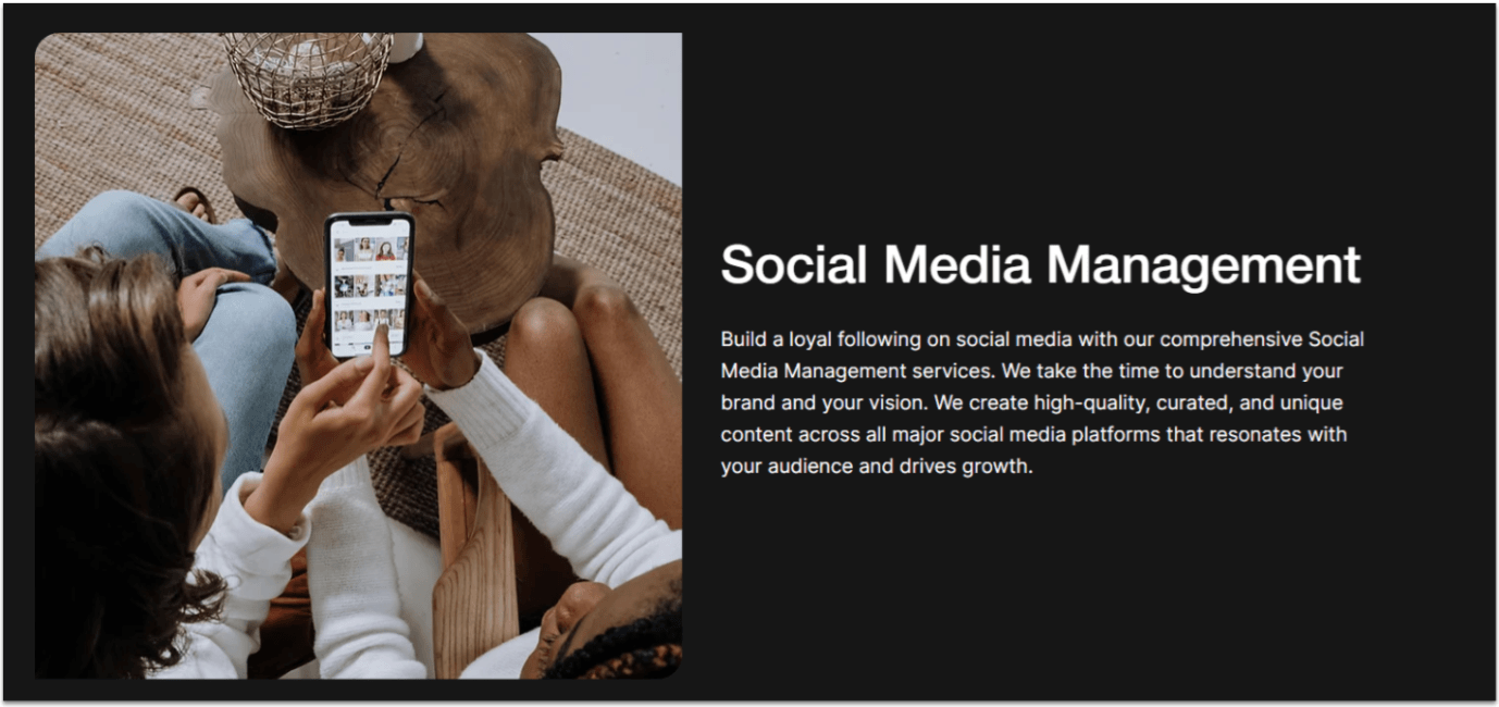 For the services section, we’ll create a two-column layout with a high-quality image on one side pertaining to the service description on the other. To increase the visual interest, we’ll alternate the sides for each new service we list.
Step 1: Create a new section with a different background color.
For the services section, we’ll create a two-column layout with a high-quality image on one side pertaining to the service description on the other. To increase the visual interest, we’ll alternate the sides for each new service we list.
Step 1: Create a new section with a different background color.- Set the background color to #161616 (HEX).
- Apply an advanced CSS grid to the section.
- Set the vertical padding (
) to 80px scale.
- Set all margins to 0.
- Apply an advanced CSS grid to the container.
- Set the container’s width to 1080px.
- Set the container’s layout to 1×3 (
) and add an extra row to get a 1×4 layout. - Set the vertical gaps (
) for the container to 50px. - Remove the container’s background.
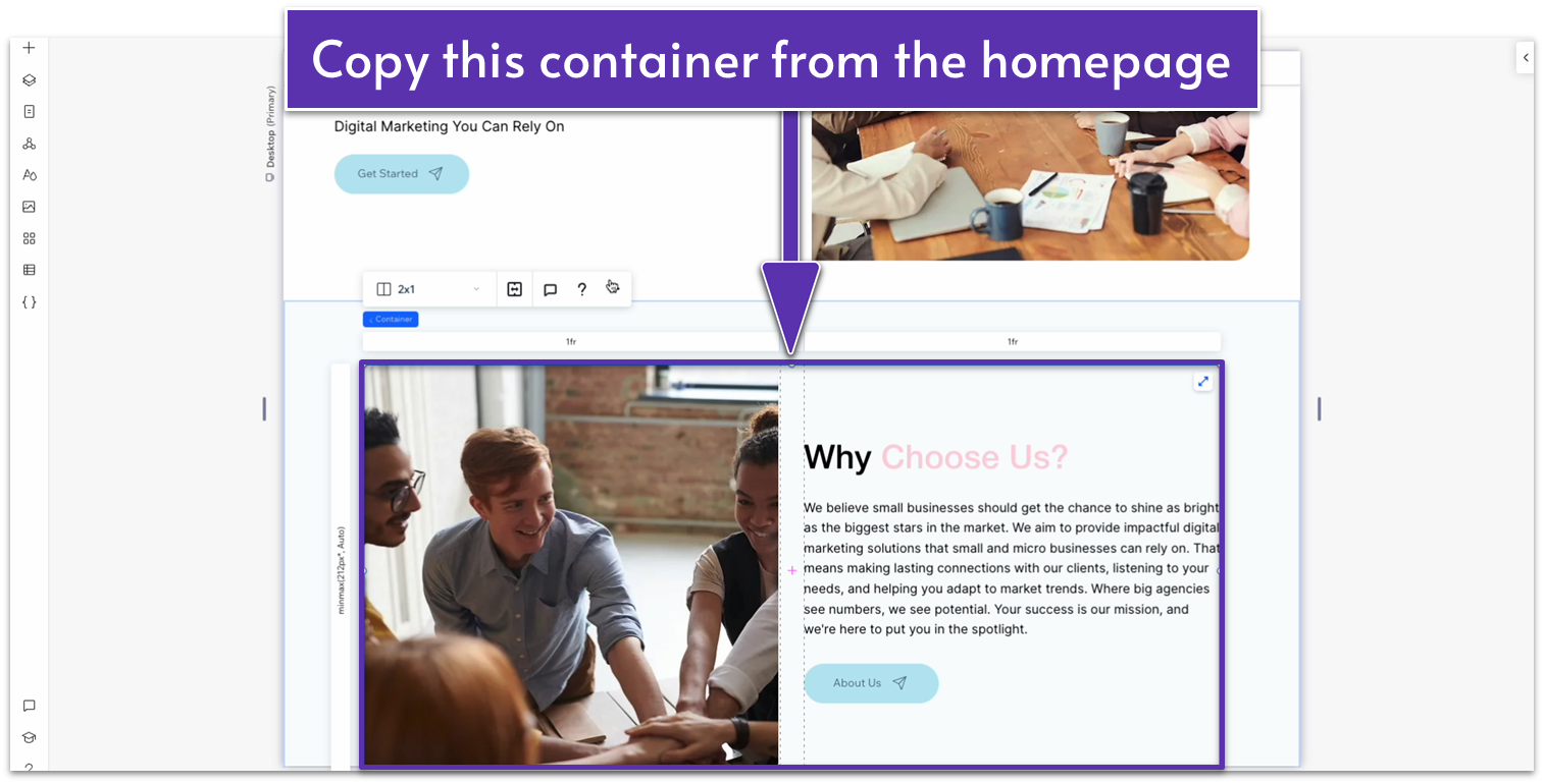 Step 4: Paste it into the container in the “Services” page
Set its location in grid cells to the top row.
Step 4: Paste it into the container in the “Services” page
Set its location in grid cells to the top row.
- Change the font color of the heading and paragraph text to white (#FFFFFF HEX).
- Delete the button from the text stack.
- Replace the heading with one of your services and the paragraph text with a more in-depth explanation of that service.
- Change the image for one that illustrates that service better.
 Step 5: Duplicate the container.
- Open the “more actions” menu (
) for the container you just edited and select “Duplicate.” - Open the inspector and move the duplicated container into the second row.
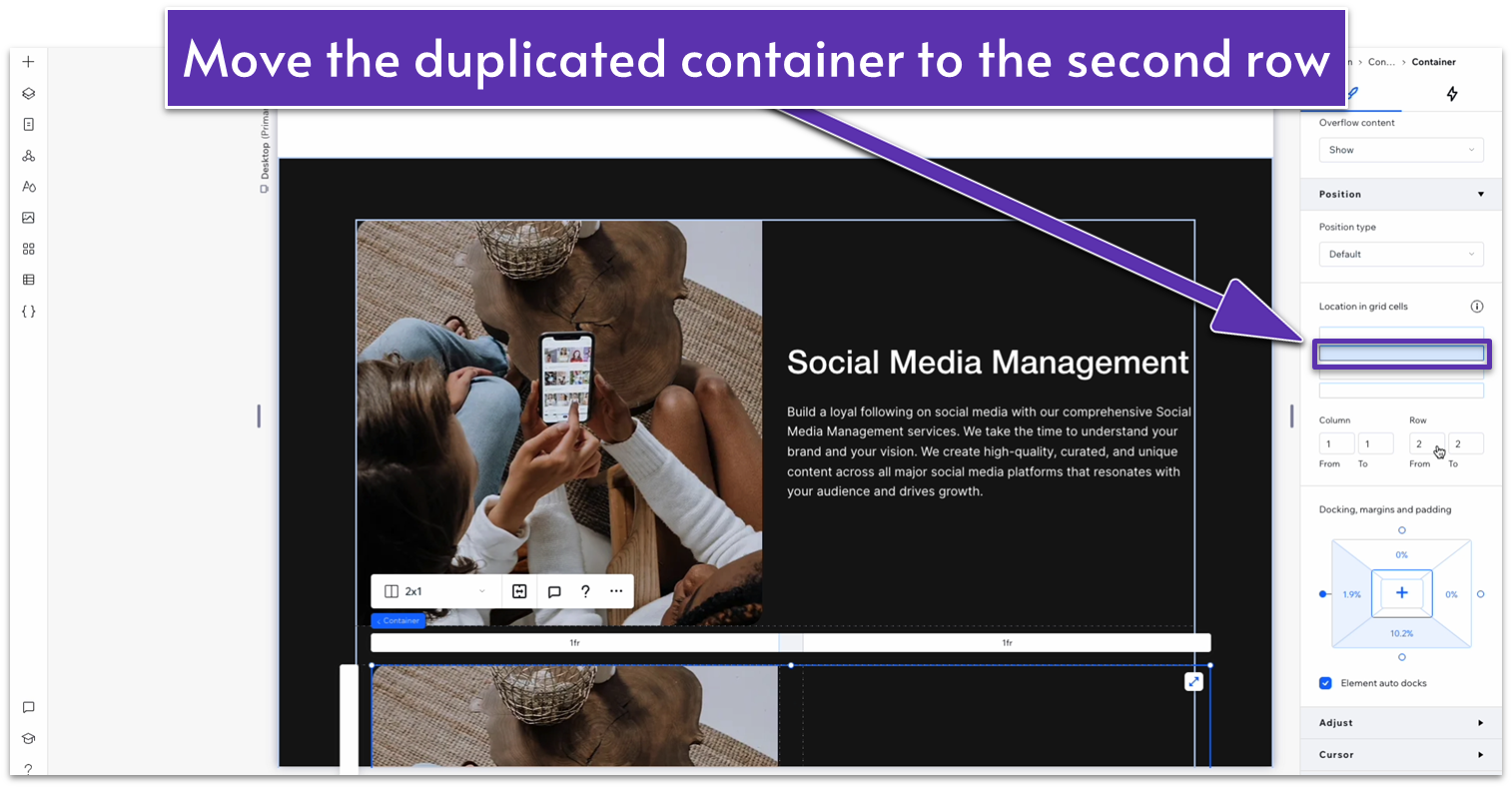
- Make sure all margins are set to 0.
- Using the “location in grid cells” option, move the paragraph text to the left-side column and the image to the right.
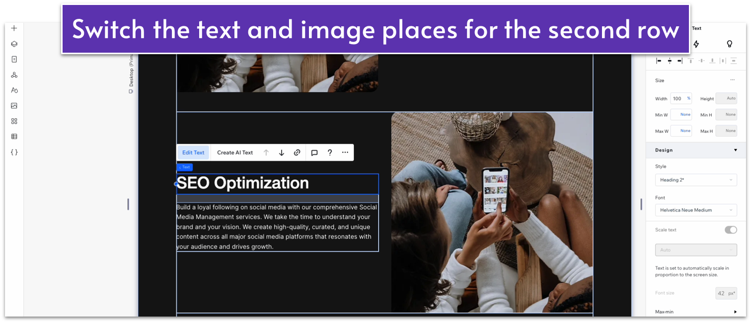
- Replace the text and image with something appropriate.
Adapt for Tablet and Mobile Views
Step 1: Adapt for tablet view. On tablet view (- Set the vertical padding (
) of the entire section to 70px.
- Set the vertical padding (
) of the entire section to 70px. - Set the vertical gaps (
) of the larger container to 50px.
5.3 Blog Section
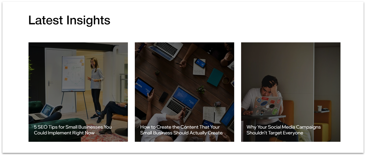 Thanks to our never-ending search for minimal effort, we’ve already created a global section for a blog strip. Now, all we have to do is insert it into the bottom of the page.
Step 1: Add the “Blog” global section to the page.
Thanks to our never-ending search for minimal effort, we’ve already created a global section for a blog strip. Now, all we have to do is insert it into the bottom of the page.
Step 1: Add the “Blog” global section to the page.- On the left-side menu, click on the icon with three circles connected by a triangle (
), this is the “Global Sections” menu. - Hover over the contact section and select “Add to page.”
- Go to the “Layers” menu (
) and drag the “Contact” section just above the footer.
